Adding Friends From Contacts
Client: Snapchat
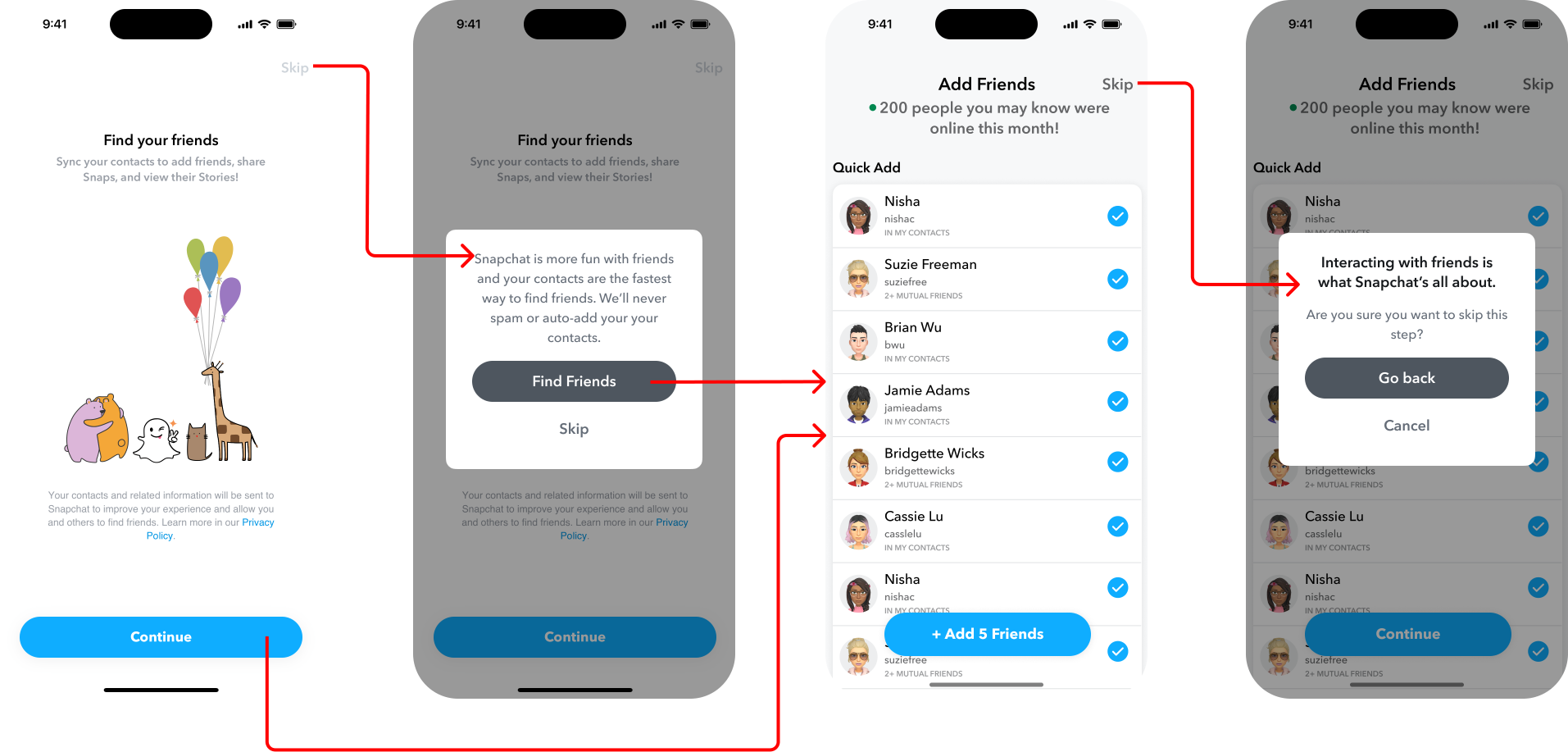
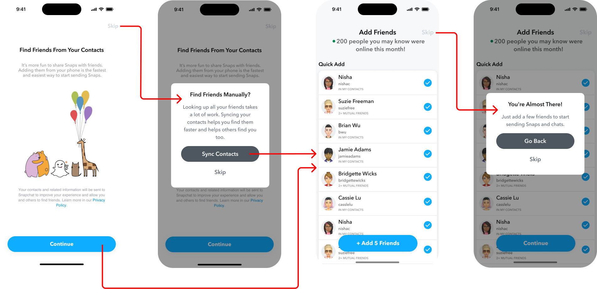
Background: Early in the onboarding flow for this social media app, the user is invited to sync their phone contacts with the app. They have the option to “skip” this step, and if they do, a modal surfaces as a second attempt to encourage the user to go back and sync. If they’re persuaded and complete contact syncing, they’re then asked to add friends from those contacts who already have accounts on Snapchat. This, too, can be skipped, which also generates a modal encouraging them to go back and add friends before continuing.
Challenge: Motivate new users to not only sync their phone contacts with Snapchat, but to then add friends from those contacts. A user completing this at onboarding is a key indicator of potential future retention. However, data showed a large amount of new users syncing their contacts but then skipping adding friends. The goal was to increase conversion here by changing content alone, with no redesign to the UI.
My Role & Solution: These revisions were part of a broader audit of the entire onboarding flow. In collaborating with the product designer assigned to this area of the app, I identified the screens that needed updates most urgently from a business perspective, and these were some of them. I proposed an entire overhaul to the flow, where we could reorder steps and minimize the number of screens and amount of cognitive load on the user. Unfortunately, I learned that engineering bandwidth only allowed for content edits, with no UI or flow changes. Not ideal, but having my parameters defined, I set to identifying problem areas with the existing content and ideating on how it could be improved.
What stood out immediately was that the content was not aligned with the current style guide. Punctuation and capitalization inconsistencies lead to confusion, so those needed to be addressed. Furthermore, one of the modals was missing a header—adding one would not only align with the style guide, but offer more opportunity to “make our case” and persuade the user.
I first revised the “contact syncing” step by employing sentiments of quickness and ease, explaining that looking up friends manually can be laborious. I then quickly shifted focus to “adding friends”, post contact-sync, since that was the more significant focus area. In analyzing the existing copy there, I identified what I felt were problems with it:
The header stated what Snapchat is “about”, but didn’t explicitly connect the dots to the importance of adding friends
The body copy posed a question: “Are you sure?”, which is not prescriptive and can feel a little condescending
I drew up several options, experimenting with different sentiments and ways of expressing them, and presented them in content design crit, highlighting my favorite options. The responses from my colleagues gave affirmation that I was on the right track. After a little honing, the new content was ready to send to production.
Ultimately, here’s how I improved on the existing content:
In the header, I employed a sense of encouragement toward completion
Using an active voice in the body, I explained the significance of adding friends (you can’t send or get Snaps without them), with a clear value proposition
Outcome: This revision saw an increase of 3.9% friend adds from this screen alone.


